Increased investor demand for gold coupled with a constrained supply has led to high prices and a bullish market, which has been operating despite these pressures on the supply chain. Today’s infographic comes to us from Sprott Physical Bullion Trust and it outlines the gold supply chain and the impacts COVID shutdowns have had on the gold market.
The Ripple Effect: Stalling a Supply Chain
Disruptions to the gold supply chain have rippled all the way from the mine to the investor:
Gold: A Safe Haven for Investors
As the virus spread around the world threatening populations and economies, investors turned to safe-haven investments such as gold to hedge against an economic lockdown. This increase in investor demand affected the four primary financial markets for gold: Each one of these markets requires access to physical gold. COVID-19 restrictions have disrupted shipping and delivery options, making it harder to access gold. The market for gold has been functioning nonetheless. So how does gold get to customers during a time of crisis?
Gold’s Journey: From the Ground to the Vault
Gold ore goes through several stages before being ready for the market. After reaching its destination via air, armored trucks with security personnel move the gold to vaults and customers in financial hubs around the world.
The World’s Biggest Gold Hubs
The U.K.’s bullion banks hold the world’s biggest commercial stockpiles of gold, equal to 10 months of global gold mine output. London is the largest gold hub, with numerous vaults dedicated to gold and other precious metals. Four of the largest gold refineries in the world are located in Switzerland, making it an important part of the gold supply chain. Hong Kong, Singapore, and Dubai are surprising additions and remain significant traders of gold despite having no mines within their borders.
COVID-19: The Perfect Storm for Gold?
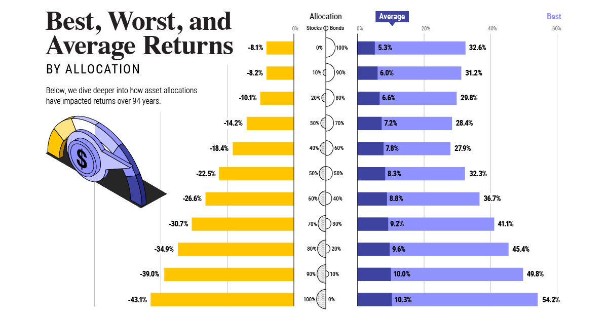
As countries took stringent safety measures such as travel restrictions and border closures, the number of commercial flights dropped exponentially across the world. For the few commercial airlines that still operated, gold was a low-priority cargo as space was dedicated to medical supplies. This impeded the flow of gold through the supply chain, increasing the cost of delivery and the price of gold. However, thanks to the diverse geography of gold mining, some countries did not halt production—this helped avoid a complete stall in the supply of gold. The COVID-19 pandemic has created the perfect storm for gold by disrupting the global supply chain while investor demand for gold exploded. Despite heightened delivery risks and disruptions, the gold market has managed to continue operating thus far. on Last year, stock and bond returns tumbled after the Federal Reserve hiked interest rates at the fastest speed in 40 years. It was the first time in decades that both asset classes posted negative annual investment returns in tandem. Over four decades, this has happened 2.4% of the time across any 12-month rolling period. To look at how various stock and bond asset allocations have performed over history—and their broader correlations—the above graphic charts their best, worst, and average returns, using data from Vanguard.
How Has Asset Allocation Impacted Returns?
Based on data between 1926 and 2019, the table below looks at the spectrum of market returns of different asset allocations:
We can see that a portfolio made entirely of stocks returned 10.3% on average, the highest across all asset allocations. Of course, this came with wider return variance, hitting an annual low of -43% and a high of 54%.
A traditional 60/40 portfolio—which has lost its luster in recent years as low interest rates have led to lower bond returns—saw an average historical return of 8.8%. As interest rates have climbed in recent years, this may widen its appeal once again as bond returns may rise.
Meanwhile, a 100% bond portfolio averaged 5.3% in annual returns over the period. Bonds typically serve as a hedge against portfolio losses thanks to their typically negative historical correlation to stocks.
A Closer Look at Historical Correlations
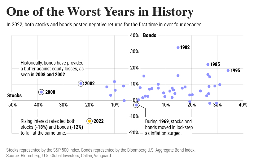
To understand how 2022 was an outlier in terms of asset correlations we can look at the graphic below:
The last time stocks and bonds moved together in a negative direction was in 1969. At the time, inflation was accelerating and the Fed was hiking interest rates to cool rising costs. In fact, historically, when inflation surges, stocks and bonds have often moved in similar directions. Underscoring this divergence is real interest rate volatility. When real interest rates are a driving force in the market, as we have seen in the last year, it hurts both stock and bond returns. This is because higher interest rates can reduce the future cash flows of these investments. Adding another layer is the level of risk appetite among investors. When the economic outlook is uncertain and interest rate volatility is high, investors are more likely to take risk off their portfolios and demand higher returns for taking on higher risk. This can push down equity and bond prices. On the other hand, if the economic outlook is positive, investors may be willing to take on more risk, in turn potentially boosting equity prices.
Current Investment Returns in Context
Today, financial markets are seeing sharp swings as the ripple effects of higher interest rates are sinking in. For investors, historical data provides insight on long-term asset allocation trends. Over the last century, cycles of high interest rates have come and gone. Both equity and bond investment returns have been resilient for investors who stay the course.
